HOT SHOT 16- VARY THE WEIGHT OF YOUR LINES
I am really thrilled to get back to blogging again, it’s been a busy summer for me-I recently took part in a plein air painting Competition in London called “Pintar Rapido”- I happened to win the First Prize, you can read about it HERE ! I have also been painting in York, that was a wonderful experience-you can read my blogposts about it by clicking HERE. I have also been illustrating two children’s books which I’ll let you know about once they are published!
Hope you have kept your sketching going?
This HOT SHOT is all about the one thing we all use while sketching-THE LINE!! The line for the sketcher is the most powerful tool! If the lines can speak, the sketch will have a great IMPACT!
But this HOT SHOT is not only about LINES but also about VARYING THE WEIGHT OF YOUR LINES!
I really can’t wait to keep rambling on, but if you missed my last HOT SHOT you can click HERE, it was all about WHAT TO EMPHASIZE in your sketches.
HOT SHOT 16
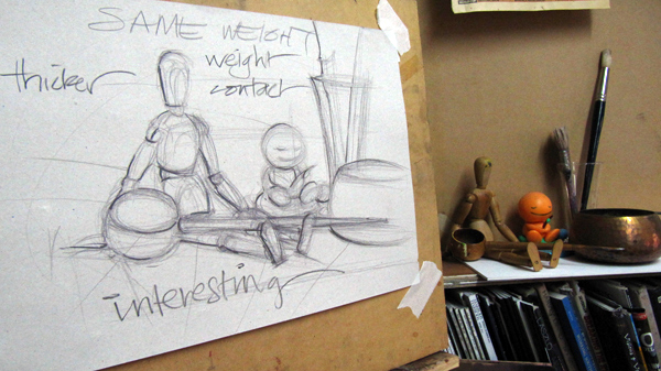
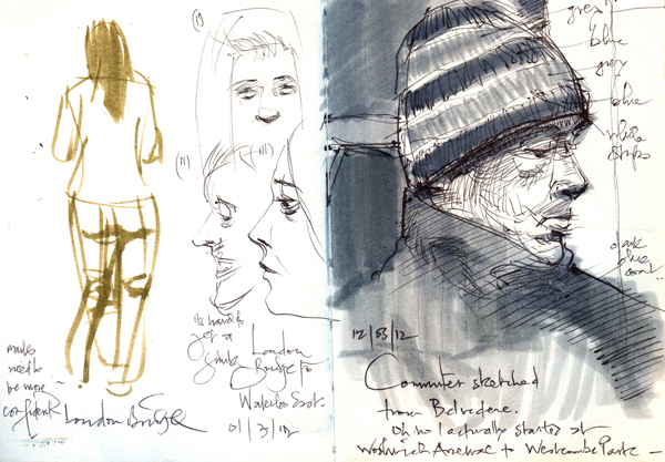
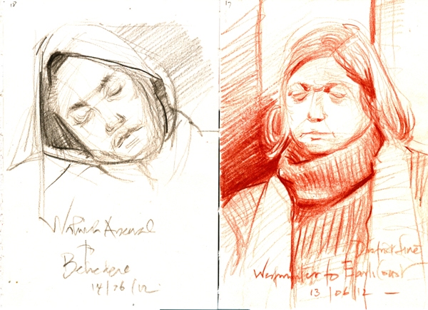
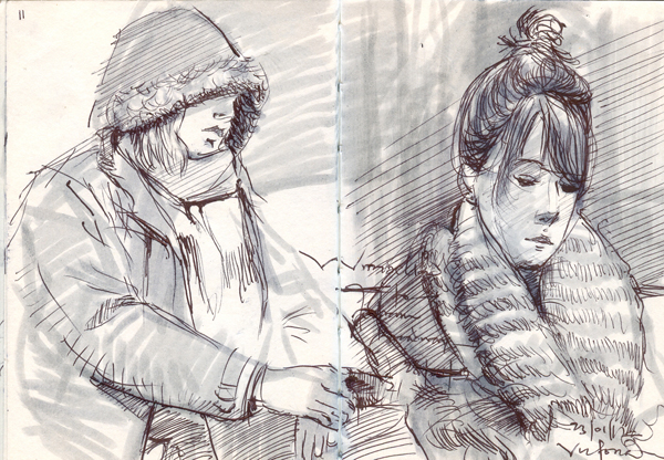
While sketching, the weight of each line you use, matters. If you love using lines, it’s always great to vary the weights of the lines, always keeping in mind that the heavier lines depict weight and the lighter lines more of direction and structure. The whole purpose of lines can be a language on its own and your ability to use them to communicate what you see and also what you want people to see is really important in The sketch inspiration!
The first video is an introduction about what the main demonstration is all about.
Now this is the main demo below, where I add the heavier lines at strategic places to bring the sketch to life!
It was in my first year at Yaba College of Technology that I discovered this technique. We had just started a course called, ‘General Drawing’. We were not allowed to shade our drawings for the first term. Everything we drew had to be just in simple lines, no more no less, just lines.
It looked like a simple way of drawing, it was quite new to me but after a few assignments and tasks, I noticed how boring it was. I loved to draw but I love shading even more. Just drawing with lines didn’t hold much interest for me.
The first time we had a review of our works. Our tutor, Pius Egiolahmen, was looking through all the drawings during a lesson one day and he highlighted one of the drawings by my class mate, by the name Robert, He said to us all, “Take a look a Robert’s drawings, what do you notice?” We all took a hard long look and the conclusion we derived from the whole process was that Robert was able to draw a simple pack of chairs with the most interesting lines, the secret of the drawing was that he varied the weights of the lines where it mattered and it brought out the most beautiful line drawing of chairs.
Now, ever since that day my line drawings changed forever!
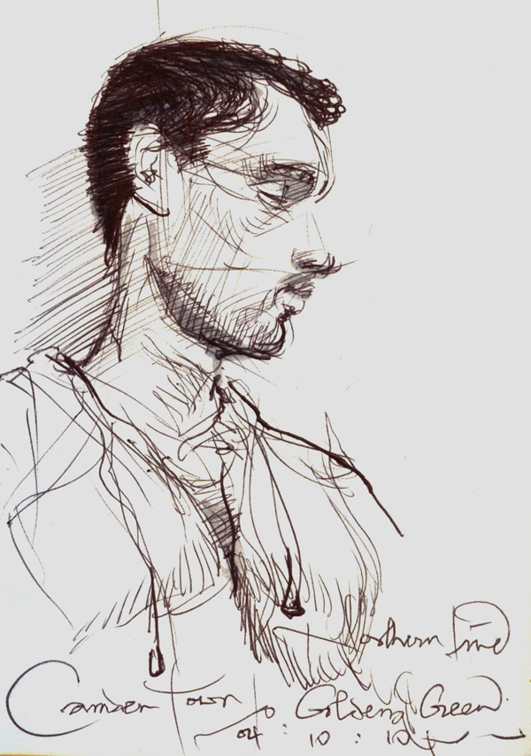
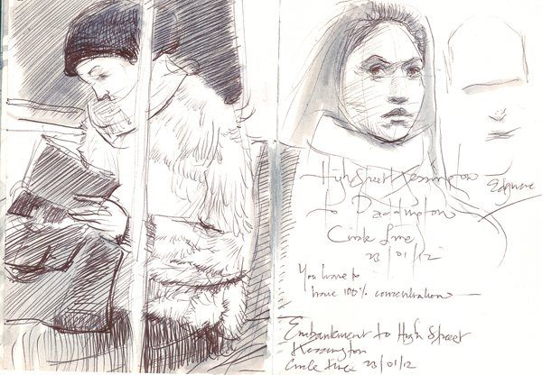
Its not just about making some thick and some thin. But if you do them with purpose and meaning, making sure that you are trying to depict exactly what you see, then the result is always striking and far more convincing! If you look at many of the drawings of the masters, you’ll see this concept being used. Always be on the look out!
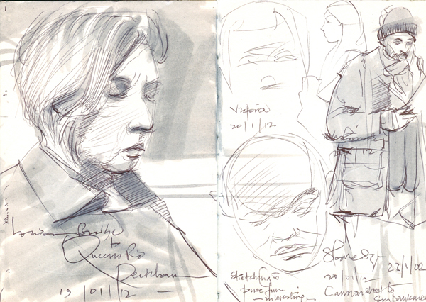
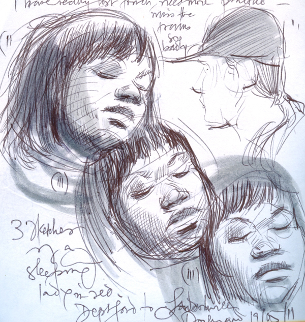
Example 2- they are here too, a major change takes place with the line under her chin and the line that connects the chin to her lips.
| Its not just about making some thick and some thin. But if you do them with purpose and meaning, making sure that you are trying to depict exactly what you see, then the result is always striking and far more convincing! | |
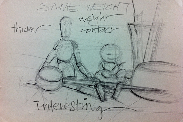
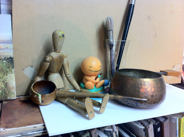
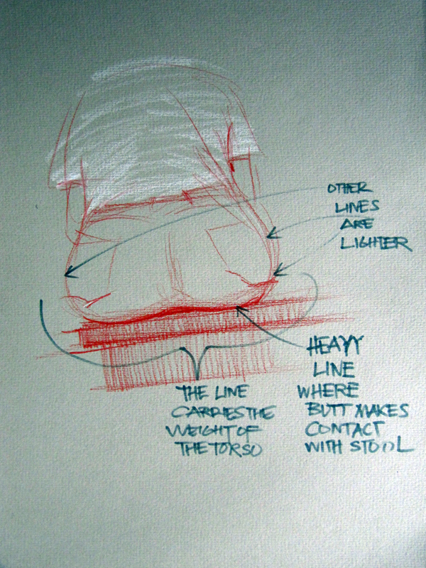
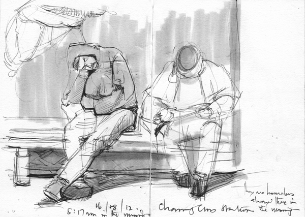
The first reason why a line should carry more weight is because it is carrying weight, the weight of whatever is pushing it down or on top of it. For instance if you are sketching someone sitting down and you could see their butt from behind on a stool. The line that falls in between the butt and the stool is bound to be thicker (heavier) and it can’t be the same as the lines that show the curve of the butt. See sketch below.
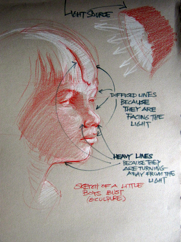
The second reason is, if something is facing the light, the line nearest to the light can’t be heavy because the light automatically diffuses the line but line that is in the shade would be heavy and darker, and invariably carry more weight. See sketch below
The third reason is when there is contact between two objects. I feel when two objects make contact there is a bit of friction and energy in that contact. I believe the lines where the contact takes place, cannot be the same as where the contact didn’t take place.
There are are many other reasons but its all for the “hawk-eyed” and diligent observer to discover!
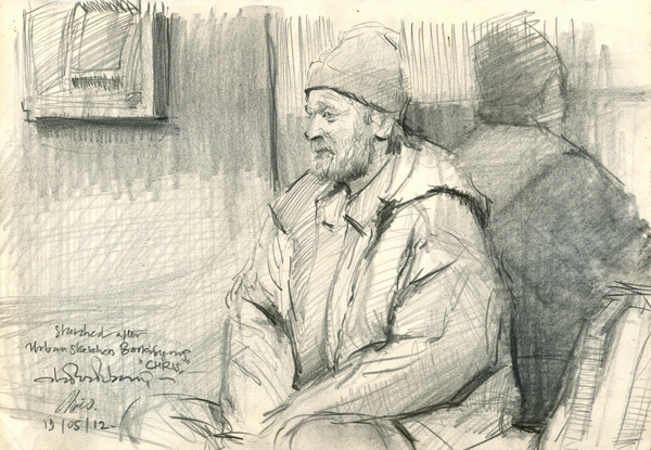
Example 5- it's very highly used here, just watch those very think lines showing weight and contact.
Once the discovery is made, it should be applied!
I love lines, I love what they do! I love the fact that you can tell a story with a few lines. But isn’t it boring if a story was told with the same voice tone…….now that would be flat! But if the story teller went high with their voice when needed and low during melancholy periods and back to normal when the story continued at a steady pace. It would be pleasing to the ear and it would keep the listener at full attention.
I hope you get the gist of this and hope you can give it a go! It’s left to each individual artist to discover what works for them!
This has worked and still works for me I hope it will work for you!
If you have enjoyed this post, please share, like, post, just everything to get the word out there and lets share the Sketch Inspiration to the world!!!!
Tagged with: A4 moleskine Sketchbook • Adebanji Alade • ball point pen • drawing tips • graphite • how to draw • how to sketch • lines • Pius Egiolahmen • sketching tips • sketching tutorials • still life • tips on sketching • Tombow dual wash pen • urban sketching • varying weights of lines • Yaba College of Technology
Filed under: Inspiration to sketch • Sketchbook • Sketching Tips
Like this post? Subscribe to my RSS feed and get loads more!


Thanks for this Adebanji, really interesting. One can see that you’ve done a LOT of drawing!
Thanks Nigel!!!
I am delighted to find a new hot spot here! Thank you for this fascinating post and the detailed explanation. Will give it a go in my next sketch. I always feel like picking up a pencil immediately after watching your videos.
Anne, I’m glad you sve found it useful. I’m also glad to post a new hot shot here too.
Oh, and congratulations on winning the First Prize!
Thanks Anne!
Great advice, I have to put it into use. Thanks for taking the time to do this. By the way, there is a Bent Nib Calligraphy pen made in China by Hero pen company on sale on ebay that makes it easy to vary line weights.
Thanks Don, I’ll have to check out those pens, although I don’t think they’ll ever do what the simple black Bic ball point pens can do. Never used anything like them!
wow, just got home can’t wait to start, thanks adebanji.
You are most welcome! Yes! Just get going- its all about doing it!
Another good Hotshot, your passion comes through everytime!
Brilliant & most enjoyable!
Ciao
Thanks Jimu!!!
Great lesson, Adebanji! Thanks so much! 🙂
You are most welcome Serena!
Love your posts, vital and energetic as are your drawings and sketches.
Thanks ever so much Kate!!!
Congratulations on First Place! What a great achievement 🙂
How simple but how true – thanks again for sharing your knowledge & experiences. I hadn’t made those observations, but will be looking for it now and applying to my sketches. Thanks for another great lesson!
Thanks Bronny!
Thanks for this post. A real eye opener
Thanks Astrid!!!
Thank you Adebanji, and congratulations on all your winning work…… it is great to have you back 🙂
Thanks Sarah!!!!
Lovely sketches…. I do hope to put it into practice and get better in my drawings. 🙂
Thanks Judith! It’s all about putting it into practice!! Once you get going, don’t stop!
I hope to. Do u tutor?
Yes I do.
Great to receive your latest hot-shot Adebanji. Another wonderful lesson. Congratulations on your first prize!
Thanks Gary!!
Thanks again for taking the time to share your talent and passion for sketching. You inspire many to explore the wonderful world of sketching.
Thanks Denise! I am happy that lots of people are catching the spirit behind sketching- its a massive skill for the representational artist!
grey job fabulous lesson
Thanks Fenando!